
We teach kids colors.
But not the shades within them.
It started with a small conversation about the color purple.
My two-year-old pointed to a color and named it confidently. When I offered a slightly different shade to compare, he insisted, in the way only a two-year-old can, that his color was purple, and mine was not.
He was right, of course, but they were both purple.
If you watch a young kid try to describe the color of a fig, or explain why their favorite purple crayon isn't quite the same as the other purple crayon, you’ll find they often default to “dark purple” or “light purple.” They're seeing the difference. They understand they're similar yet different. But they don't have the descriptive vocabulary for it yet. Naming a red strawberry red is more descriptive (and fun) than simply bright red.
That's why I made these cards: to help children describe what they're seeing through something they already understand: fruit! Because show me a kid who doesn't like fruit and I'll show you a basket of dino eggs.
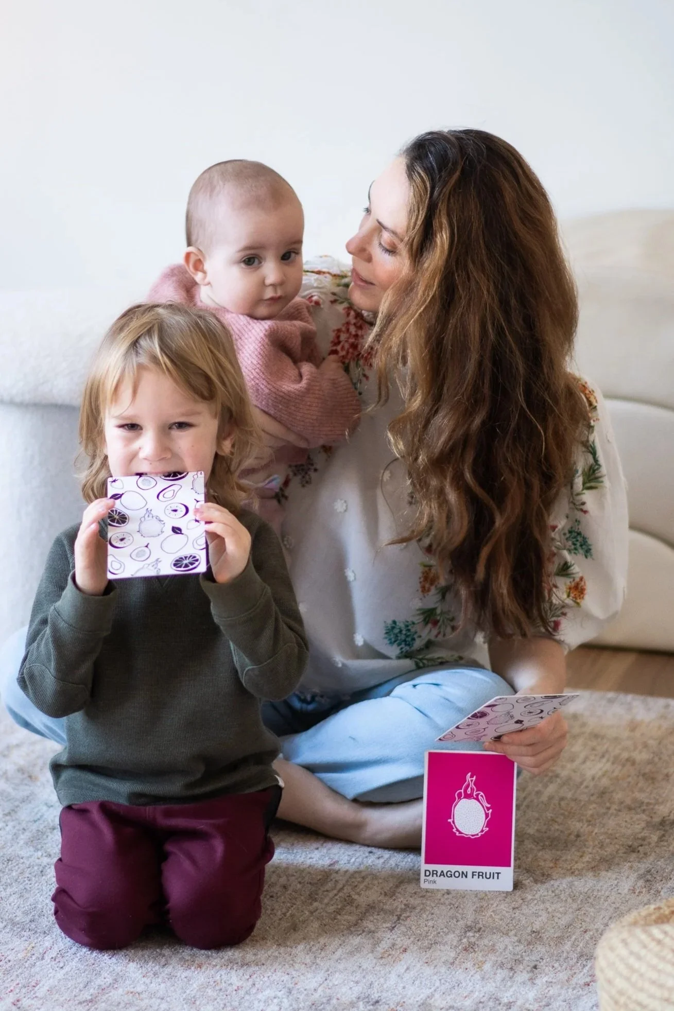
Beyond primary colors
As a designer, I've spent my career working with color and how we perceive and express color is an essential part of being human. Pantone built an entire language around exactly that idea, and when I was thinking of how to convey shades to my son, Pantone had a strong influence on me.
But I didn't want to teach my son color theory. I wanted to give him something simpler, more useful, and fun for his age — the ability to look at a color and reach for a word that was actually true to what he was seeing and experiencing daily.
Not just yellow. Lemon yellow. Not just purple. Fig purple. Not just green. The specific, complicated green of an avocado. But, the exact color or shade isn’t the point; it’s how we perceive even the smallest color difference that matters. Pineapple and lemon are similar in color yet different. Our brains evoke a different sense when we express a color with an adjective in front of it. Strawberry red feels bright, it evokes summertime, and sweet and sour simultaneously. Pomegranate red evokes fall, and a bright, juicy red.
These cards teach color as vocabulary. A way of seeing the world more intentionally, and describing it more colorfully.
How it came to be
Around the same time that I was having color conversations with my son, I was pregnant with my second child. What began as a quiet idea during late nights of pregnancy insomnia slowly took shape into something I wanted to share, first with both my children, then with others.
As a mom, I wanted to create something that could be a mainstay in our home. Something that wouldn’t quickly be disregarded and inevitably put into the giveaway box. Something that would bring me joy when I saw it strewn across the floor.
The bold black-and-white side engages babies from their earliest days. The color side grows with them. And the fruit? Some of it your child knows well. Some is waiting to be discovered. I wanted to create something we could bring with us in the car, to the grocery store and to the farmer’s market, where we could explore the fruits together and where they could take ownership of their findings.
Eighteen cards. Six color families. Three shades each. A small but meaningful invitation to look more closely at the world of color.